
Key Learnings from an Accessibility Review of our Website
Partway through completing data collection for the first phase of the SOARWell research project (interviews with older adults using voice assistants), we realized that our online presence was not particularly accessible for people who are blind or partially sighted and/or those who use screen readers. Although the website was designed following Age-Friendly Communication principles, and we considered things like font (e.g. larger size, sans-serif style), use of color and contrast, and presentation of information (e.g. lay language, visuals), we did not design it with explicit attention to all aspects of web accessibility covered by the AODA – Ontario’s with Disabilities Act.
Reviewing and improving the accessibility of our website is important for both research participants (current and future) and any individuals interested in the work that we do. Our participants have a variety of abilities, including some who have identified as having a disability directly in onboarding meetings or others who have shared health-related challenges or accommodations. All of these experiences have confirmed to us the need to consider differences in vision, hearing, mobility and dexterity, and speech when it comes to using technology related to the research project (e.g. our website, Google Nest Hub, MS Teams). Outside of working on this project, I personally am involved in disability-related advocacy work in my community, and so, while I am limited to my own experiences and abilities, I am familiar with many challenges individuals face when interacting with systems not designed for them. There can be many barriers to participating in research or accessing information online, and so, if we could make some changes to address this, I was eager to embrace learning more about necessary improvements.
To conduct our accessibility review, our team reviewed guidelines on the topic, used digital resources, and engaged with Swarali Gogate, a user experience consultant. Swarali audited the site against Web Content Accessibility Guidelines (WCAG) and heuristic principles to identify areas for improvement. Since our website pages feature a lot of valuable, text-heavy research, she focused her design work on creating a clear visual hierarchy for this content. By reorganizing the layouts, the dense information was made easier for visitors to read and navigate.
Our team also consulted individuals who use screen readers to access websites, taking feedback from their lived experiences and recommendations. We used digital resources to identify parts of our website that had low contrast between text and the background, and places where the text was too small. In speaking with individuals with lived experience, navigating the website and the lack of descriptions for images arose as key issues.
Changing text size and colour was the easiest adjustment for our team to make. The part that required more effort and consideration on our part was preparing alternative text descriptions for all the images on our website. Our website had a large number of images that conveyed information or contributed to the atmosphere but were not described. To ensure that we took a participatory approach to revising the information on the website, we drafted initial descriptions for team members’ existing headshots and then shared these with them so they could edit these as they wanted. We also reviewed all the photos used on the website, including those related to our research project, background images, and interactive icons and decided which to replace, keep or remove; for those we kept we drafted descriptions. We wanted to retain images that conveyed meaning about the research, so description made more sense to our team compared to taking away images and making the website more minimalistic.
To learn more about how to create alternative text, we turned to resources from the Government of Canada and the Perkins School for the Blind. Based on this learning, our goals in preparing descriptions were to adequately describe any visual information, focusing on what is necessary to understand the image, without going into many, very specific details that would take much longer to describe. When deciding what aspects of images were most important to describe, I tried to consider what was the minimum amount of information required to have a meaningful understanding of the image and its purpose. At times, we decided to include descriptors related to colour (e.g. color of clothing worn or hair), recognizing that while this might not be meaningful for all individuals using a screen reader, but would be for some individuals may have partial vision or previously had vision that would make the detail still relevant. Describing colour in some images may also be useful for colour blind individuals.
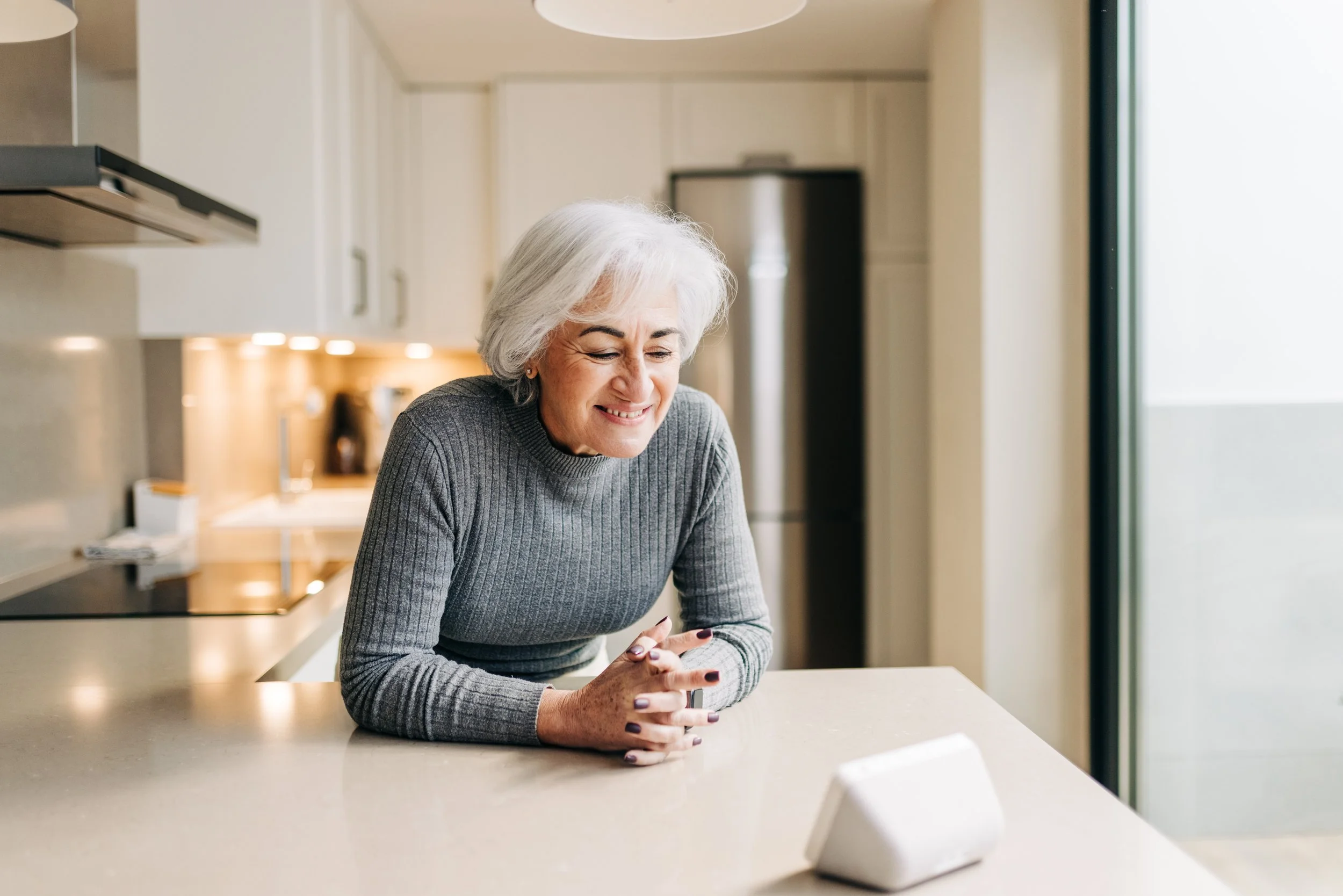
For example, our prepared alt text for this image is “an older woman with white short hair and a grey turtleneck sweater leans on a kitchen counter, smiling at a small white Google Home Max smart speaker in front of her”.
When it came to describing headshots of our team, I (Mya) drafted a description that included each person’s name, role in the project, gender, the type of photo (e.g. professional headshot or photo), and a brief description of their position/facial expression, hair color and/or clothing. I then reached out to each individual separately to share this example and invite them to review and add other aspects of their identity as they felt relevant (e.g. race, ethnicity, age), or to revise and remove any of the descriptors I used for them. Without directly communicating descriptors related to race, ethnicity and/or age in alt text, individuals accessing the website via a screen reader would miss knowing these details about our team. Describing such aspects of identity explicitly ensures that anyone accessing alt text is aware of the full diversity of our project, and representation of different facets of identity both in stock images used and in our research team (Adegbite, 2022). Ultimately, final descriptions were left to the discretion of each person to respect each team member and how they would like to publicly identify themselves.
The process of doing the review, editing our website, and preparing descriptions required much reflection on our intentions behind this project. Something as simple as a background stock photo contributes to the feel of a webpage, and thinking about the best way to approach describing both myself and my colleagues required sensitivity and additional investigation into promising practices and recommendations in this area. While we may have completed our accessibility review; there is still much to learn about the topic and future efforts to create inclusive environments in research. I know that personally, this is something I will continue to consider and prioritize to increase accessibility of research—especially in work that centers older adults.